How to optimise your checkout process with Saferpay Fields
17 / 03 / 2020
Web shop checkout optimisation often leads to double-digit improvements in the conversion rate for merchants.

A user-friendly checkout can drastically reduce terminated purchase processes
Web shop checkout optimisation often leads to double-digit improvements in the conversion rate for merchants. Although there is no single ideal process that can be applied to all shops, industries and customer segments, some general principles can be identified that which we will look at below. With Saferpay Fields, we offer online merchants a simple and secure solution for implementing One-Page Checkouts. Also, thanks to its great flexibility, customer-specific checkout flows can also be implemented. In this blog post, we’ll show you how you can use Saferpay Fields to optimise your checkout flow, reduce abandoned shopping carts and thus achieve a higher conversion rate.
Functionality with safety
Saferpay Fields are a set of ready-to-use and easily integrated form fields that can be used to enter credit card data to create your own payment forms or checkouts. In contrast to the Payment Page Integration, which is a plug-and-play solution, Saferpay Fields offer total freedom in creating and designing your own forms – and thus provide ideal conditions to carry out customer-specific optimisations for the checkout flow. As a merchant, this gives you full control over your checkout flow while Saferpay guarantees the functionality and security of the input fields. And since we ensure that you cannot come into direct contact with sensitive credit card details, the lowest PCI classification – SAQ-A – remains relevant for you. Thus no PCI certification is required on the merchant side.
Tip: After making technical adjustments to the checkout process, check regularly to make sure that everything is still behaving as expected and that orders can also be placed smoothly with on mobile devices.
Good usability creates trust
A common reason for payment cancellations is a lack of trust on the part of the buyer. Good usability and a consistent look & feel throughout the shopping process help build trust and lead to a professional and visually appealing overall impression. In implementing Saferpay Fields, we especially focused on simple and user-friendly usage. The standard design of Saferpay Fields is intentionally kept neutral and can be easily adapted to your company’s corporate identity as well as your web shop’s corporate design (CD).
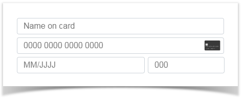
Here, you can see the four Saferpay Fields: cardholder, card number, expiry date and verification number in the standard layout.

In the field for the card number, the means of payment is automatically recognised during entry and the corresponding logo is displayed:

When entering the card number, expiry date and verification number, only numbers can be entered. On mobile devices, the numeric on-screen keyboard is automatically displayed for easier data entry.
Tip: Use well-known shop seals of approval and display evaluations from satisfied customers to further strengthen the trust of your customers.
Customisable look & feel
A uniform appearance contributes a lot to a positive overall impression. With Saferpay Fields, you now have the opportunity to customise the look & feel of the payment window to suit your individual needs.

With a single line of styling details you get this result, for example:

Try this example out now: https://jsfiddle.net/moLhp54r/
Other layouts can be realized with little additional effort. Here is an example that uses a green frame to show fields with valid content, while fields with invalid entries are framed in red:

Try this example out now: https://jsfiddle.net/saferpay/o8qb0ghv/
In this way, invalid entries such as an incomplete or incorrect card number or an overdue expiry date become directly visible. Read the chapter on Saferpay Fields in our Integration Guide for more information on technical details.
Tip: When designing your checkout process, make sure that mandatory fields and optional information are clearly identifiable as such and, in the case of special fields such as a password field, that the criteria to be met are precisely described. In this way, you improve the user experience by preventing frustration.
The One-Page Checkout: A sample implementation
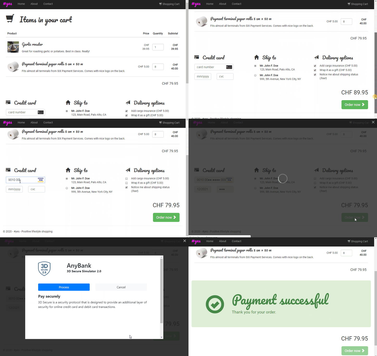
Another popular method for optimising the checkout process is the One-Page (also known as Single-Page) Checkout, where all customer details required for the entire checkout process are requested on a single page. This eliminates the need for a process flow that’s divided into several steps, where it is often difficult for the customer to maintain a clear overview– especially when previous entries are lost by jumping back and forth. With One-Page Checkout, however, the customer has a clear and complete overview. Thanks to their flexibility, Saferpay Fields are ideal for implementing a One-Page Checkout.

Tip: Follow the principle of data minimization and only request truly necessary data from your customers. This way, everything can fit simply and clearly on a single page. For fields whose purpose is not immediately apparent, the intended use should be clearly explained in order to create confidence.
An advanced interactive example
Saferpay Fields also allow special requirements to be implemented. This lets you try out different options to see which solution best suits your needs.
JavaScript Callbacks allow your developers to respond to specific incidents and interact with the user to help them enter the required data.
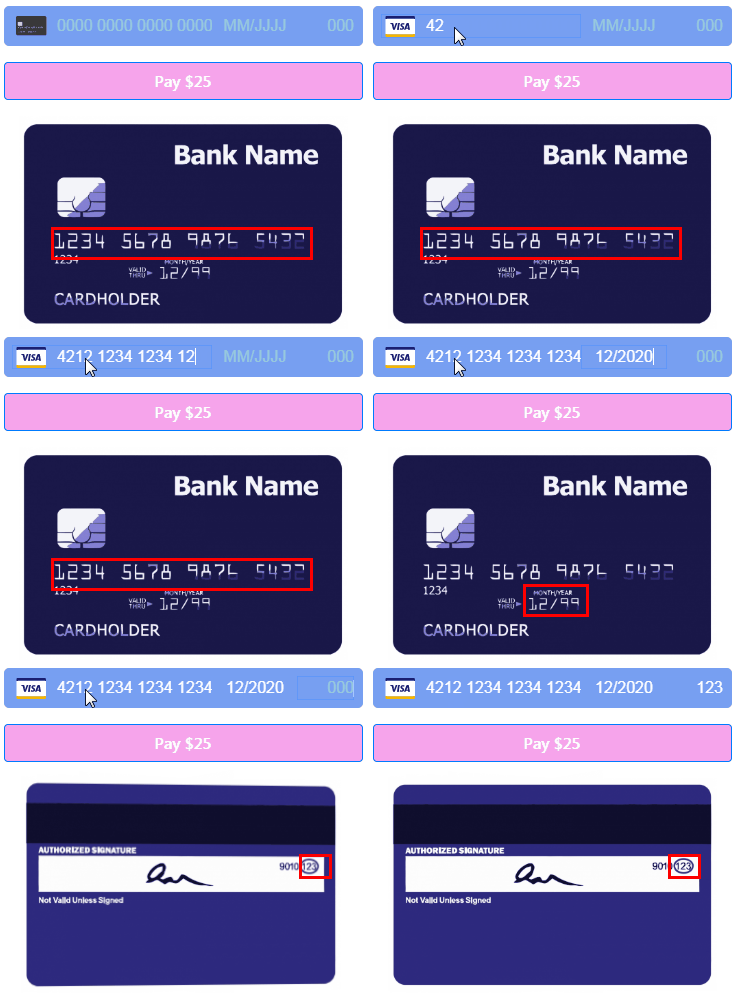
Here is an example where the card number, expiry date and verification number are visually displayed in a single field. On a credit card icon screen, the area where the corresponding entry is usually found is highlighted.

You can also try out this example in a live setting here: https://jsfiddle.net/saferpay/xt83g4r2/
Tip: Online shops which require a mandatory buyer registration discourage many potential customers. Creating a customer login should therefore always be a voluntary option. You can make it easier for undecided customers to continue shopping later, for example, by extending the session validity period and supporting reminder lists. Both measures can help to reduce the rate of shopping cart abandonment and thus increase turnover.
Choosing the right payment methods
Why not check whether the means of payment you offer are optimally suited to your target markets? We are continually expanding Saferpay’s functionality and regularly adding new means of payment. A list of all the means of payment currently supported by Saferpay can be found here.
Our experts are happy to advise you on the right means of payment to go with for your business.
Tip: Customers appreciate transparency – especially when it comes to costs. Therefore, make sure that costs, delivery conditions, warranty and return conditions, etc. are easy to find and clearly stated.
Next steps for using Saferpay Fields
To use Saferpay Fields, you need a Saferpay Business licence.
Before you can get started with the technical implementation, a Saferpay Fields Access Token is required. This can be quickly and easily created in Saferpay Backoffice. Learn more in our Integration Guide:
If you have questions or difficulties with the integration process, please contact our Integration Support.
Feedback
Did you enjoy this article? What do you think of Saferpay Fields? What could we do better? Let us know at. When optimising the conversion rate, the basic principle is always: "The proof of the pudding is in the eating" Try to identify with your users and understand the reason for purchase abandonments. A good web analytics solution helps to reconstruct the individual steps a customer took before the abandonment. With these insights, you can then initiate measures to prevent future abandonment. We wish you every success!
Opinia